Contents
- What Is a Website Color Scheme?
- The Significance of Website Color Schemes
- Setting the Mood
- Accentuating the Right Elements
- Boosting Brand Recognition
- Examples of Stunning Website Color Palettes
- 1. Dark-Themed Elegance
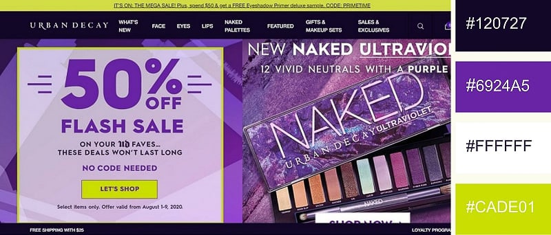
- 2. Shades of Purple
- 3. Sky Blue and Yellow
- 4. Complementaries on White
- 5. Warm Pastels and Nile Blue
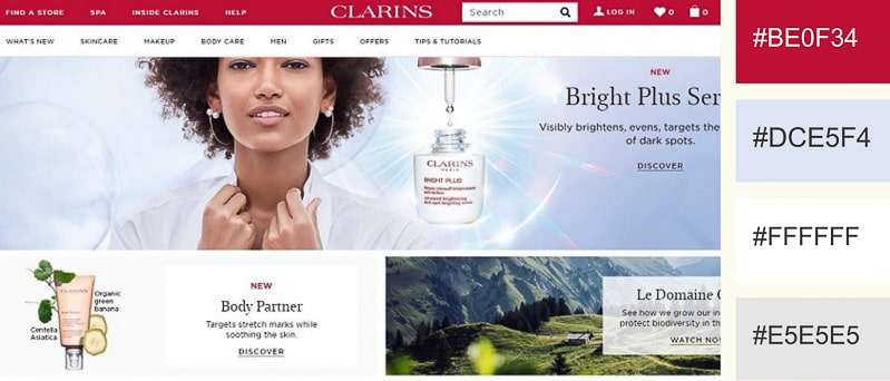
- 6. Energetic Red
- 7. Airy Boldness
- 8. Minimal Green
- 9. Playful Pink
- 10. Neon Craze
- 11. Black and White Dream
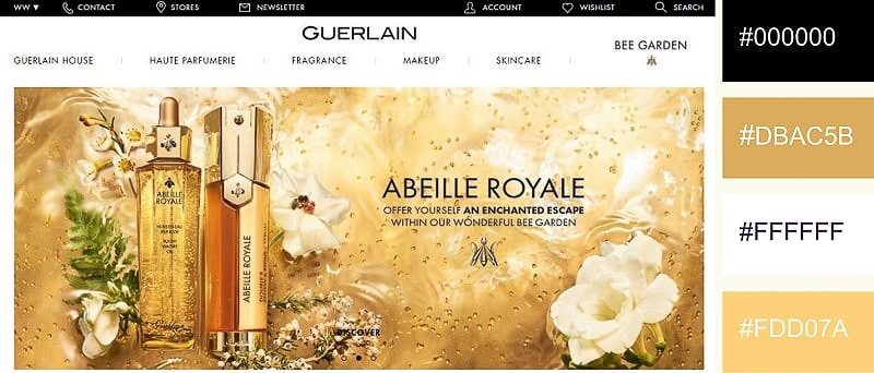
- 12 . Gilded Luxury
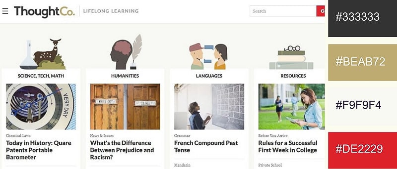
- 13. Reserved and Professional
- 14. Violet Vibrancy
- 15. Lush Pink Accents
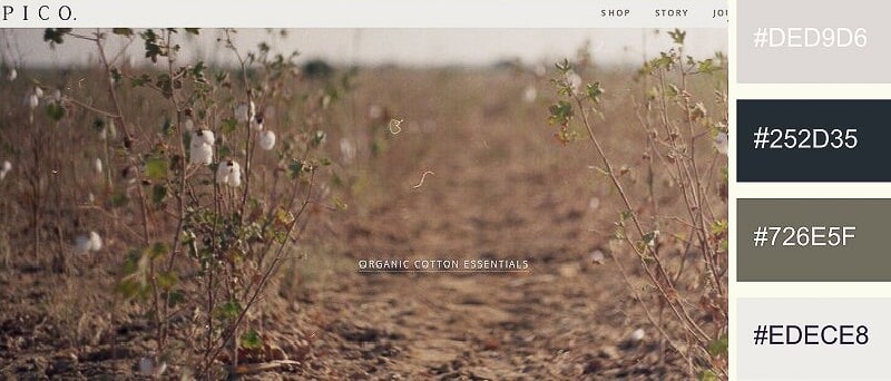
- 16. Earthy Shades
- 17. Silver Moonlight
- 18. Faded Beige
- 19. Pinch of Color
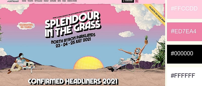
- 20. Retro Pink
- Conclusion