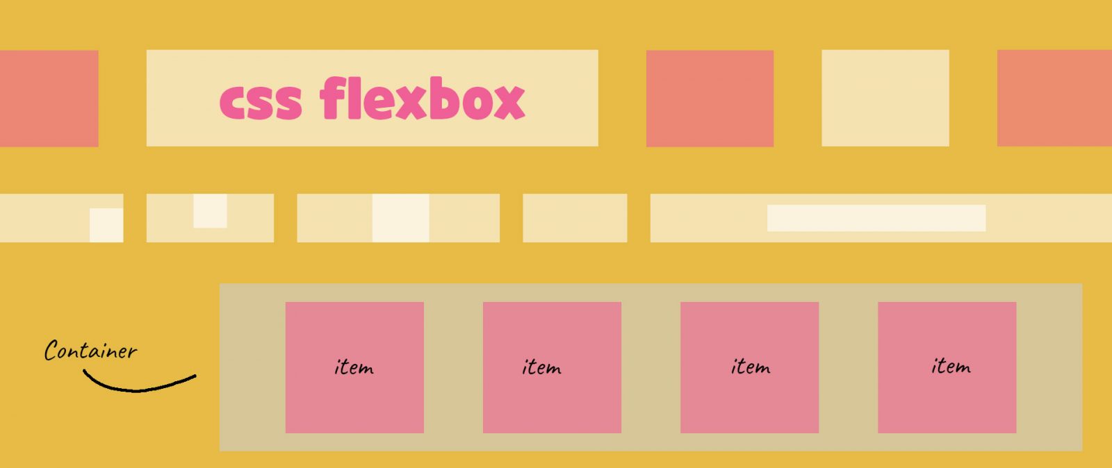
Flexbox is one of the patterns that help to align layouts easily and flexibly. However, understanding and using it is not easy. In today’s article, I will help you learn about how to use flexbox effectively and correctly. First, we need to understand the structure of the flexbox.
1. Cấu trúc:
Flexbox consists of 2 main components: Flex container and flex items along with some properties:
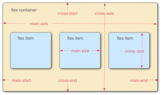
Main start: The starting point of the container along the main axis.
Main end: The end of the container along the main axis.
Cross start and cross end: Similar but based on the cross axis.
Main axis: The direction of the displayed items, by default, it will run from left to right.
Cross axis: The axis is perpendicular to the main axis, running from top to bottom.
Main size: This is the size of each item based on the main axis.
Cross size: The size of each item is based on the cross axis.
2. Thuộc tính thùng chứa linh hoạt:
| Properties | Meaning | Values |
| display | Define the flexbox property | flex |
| flex-direction | Choose the display direction of the items, this allows us to change the position of the flex items. | row: item from left to right along the main axis. row-reverse: items will be placed from right to left according to the main axis. column: items will be stacked from top to bottom. column-reverse: same as column but items will be sorted from bottom to top. |
| flex-wrap | To determine if the items fit inside the flex container | nowrap (default) wrap: items will be completely wrapped in the container. wrap-reverse |
| flex-flow | Shorthand for flex-direction and flex-wrap with the first value being flex-direction and the second being flex-wrap | |
| justify-content | Align items horizontally | flex-start: will set the item to start from the main start (and this is also the default value). flex-end: will place item starting from the main end center: will place all items in the center of the main axis. space-between: will divide the extra space evenly and add it between items. space-around: will split the spacing at the beginning and the end. The distance at the beginning and the end will be half of the distance between the two items together. space-evenly: will evenly divide the distance between items and items, item and main start, item and main end are equal. |
| align-items | Align items vertically | flex-start: Item is placed at the start of the cross start (top left). flex-end: Item is placed at the start of the cross end (bottom left). center: Item is vertically centered. baseline: Item will be placed according to the line height of the text. |
| align-content | Like justify-content but vertically | align-content: stretch. align-content: flex-start. align-content: flex-end. align-content: center. align-content: space-between. align-content: space-around. |
Above is an introductory article about the flexbox property in CSS. Hope the article will be helpful to you. Goodbye and see you again.
Tham khảo: