Long time no see, after a month I came back with a different mindset. Just a few days ago, I accidentally read a pretty good article related to UI/UX, must be a frontend-developer, UI/UX is also a very interesting part of my work. you. Good UI alone is not enough, or UX alone is not enough. “A beautiful but unwieldy interface is an example of good UI and bad UX. On the contrary, an easy to use product with a bad interface is an example of good UX and bad UI.” How to make the user experience with your product comfortable and easy to use? So, in today’s post, I’m going to take a look at some of the best animation tips in UX. Let’s go!!
1. Animation time and speed
When elements change their state or position, the duration of the animation should be slow enough for the user to be able to notice the change, but at the same time fast enough to not have to wait.
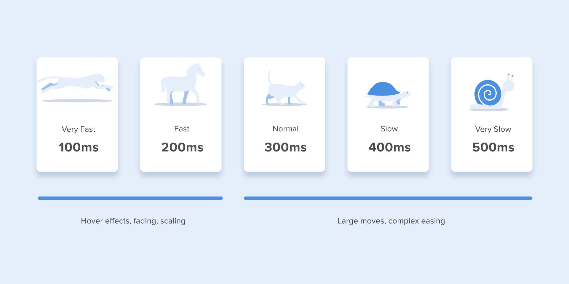
Many studies have found that the optimal speed for interface animations is between 200 and 500 ms. These numbers are based on the special qualities of the human brain. Any animation shorter than 100 ms gives the sensation of teleportation and will not be recognized. Meanwhile, animations longer than 1 second will convey a sense of delay and thus will be boring to the user.
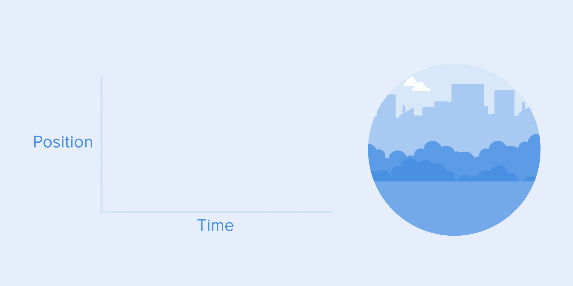
On mobile, For tablets, the duration should be 30% longer – about 400–450 ms. The reason is simple: the larger screen size causes objects to take more time to traverse the longer path as they change positions. On wearables, the duration should be 30% shorter – about 150-200 ms, because on smaller screens the travel distance is shorter.
Animation on the web is handled in a different way. Since we are used to opening web pages almost instantly in a browser, we also expect quick transitions between different states. So, the web conversion time will be about 2 times longer than it is on mobile devices. In other cases, users will definitely think that the computer hangs or has problems with the internet connection.
But. Forget about these rules if you are creating decorative animations on your website or trying to draw the user’s attention to certain elements. In these cases, the animation can be longer.
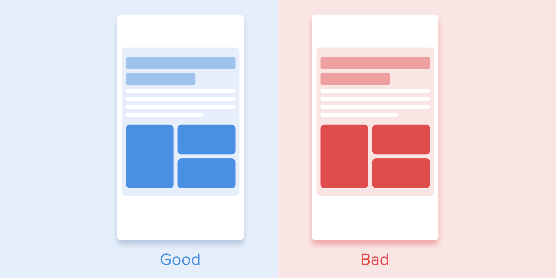
You need to remember that regardless of the platform, the duration of the animation will depend not only on the distance traveled but also on the size of the object. Smaller objects or animations with small changes should move faster. Accordingly, animations with large and complex elements look better when it lasts a little longer.
In case, when there is a collision animation between elements, for example as shown below. It is better to exclude the bounce effect. Only use it in special cases when it makes sense.
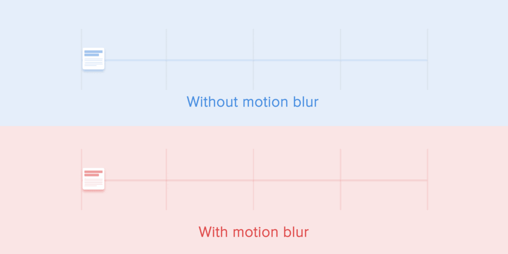
Motion of objects should be clear and sharp so no motion blur (after Effects’ motion blur) should be used. It is very difficult to reproduce the effect even on modern mobile devices and it is not used in interface animation.
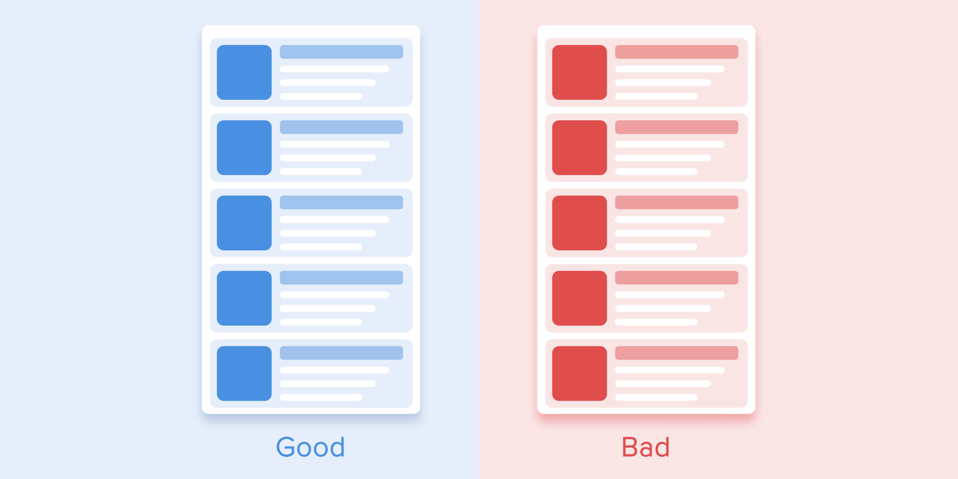
List items (news cards, email lists, etc.) will have a very short delay between their appearance. Each occurrence of the new element will last between 20 and 25 ms. The slower appearance of elements can make users feel like they have to wait unnecessarily.
2. Easing - Liner
2.1. Easing
Easing helps to make the movement of the object more natural. It’s one of the fundamentals of animation, thoroughly described in the book The Illusion of Life: Disney Animation, written by two of Disney’s principal animators – Ollie Johnston and Frank Thomas.
For non-realistic and man-made animations, objects should move with some acceleration or deceleration – like all living objects in the physical world.
2.2. Liner motion
Objects unaffected by any physical force move linearly, in other words at a constant speed. And just because of this fact the liner looks very unnatural and fake in the eyes of the user.
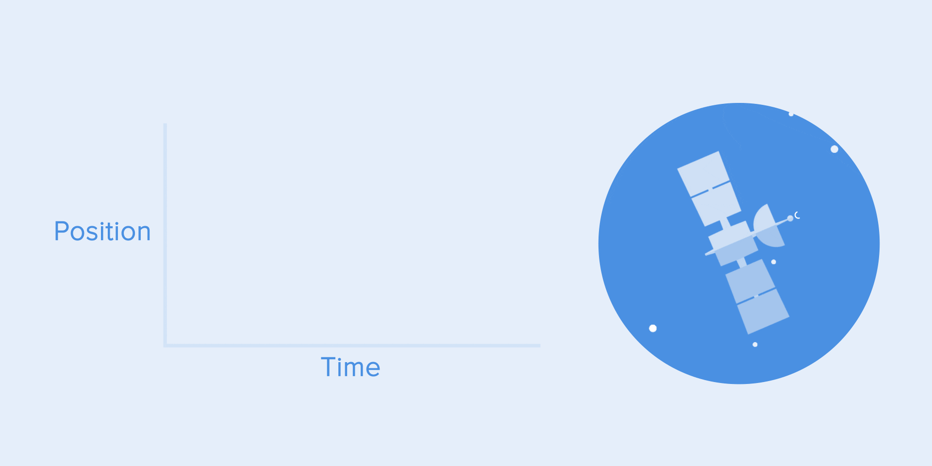
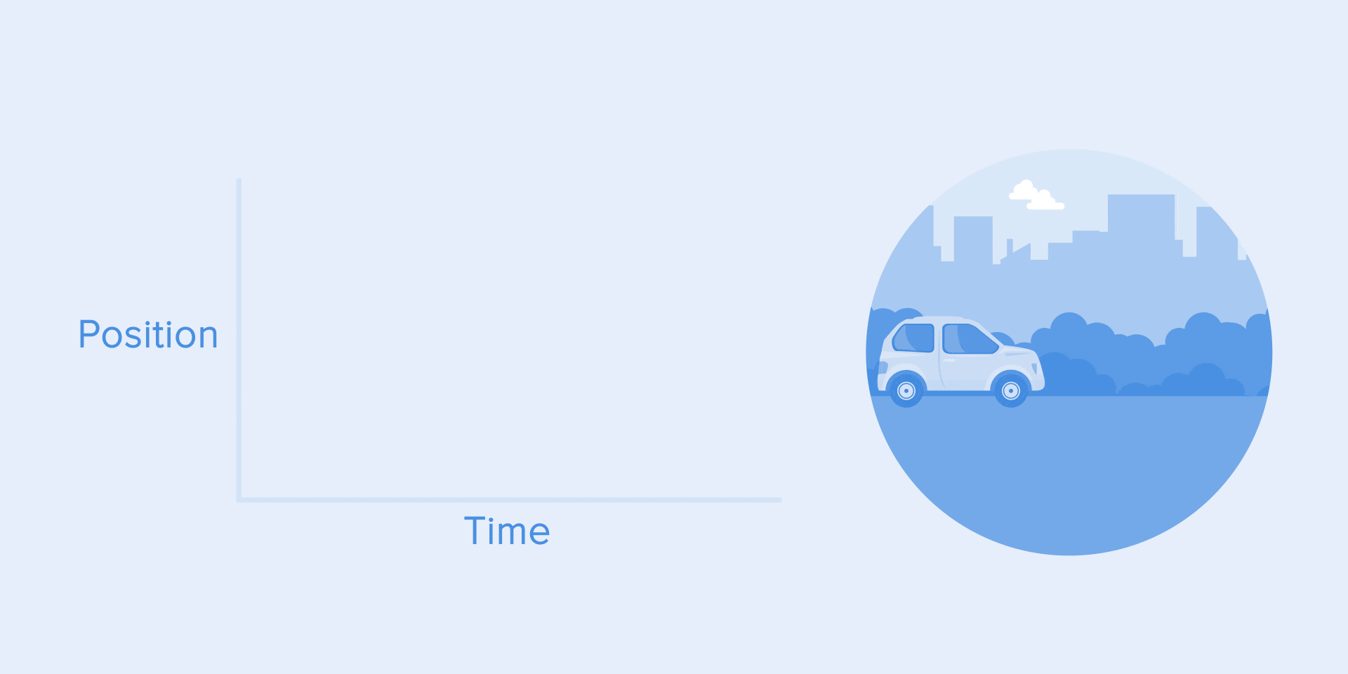
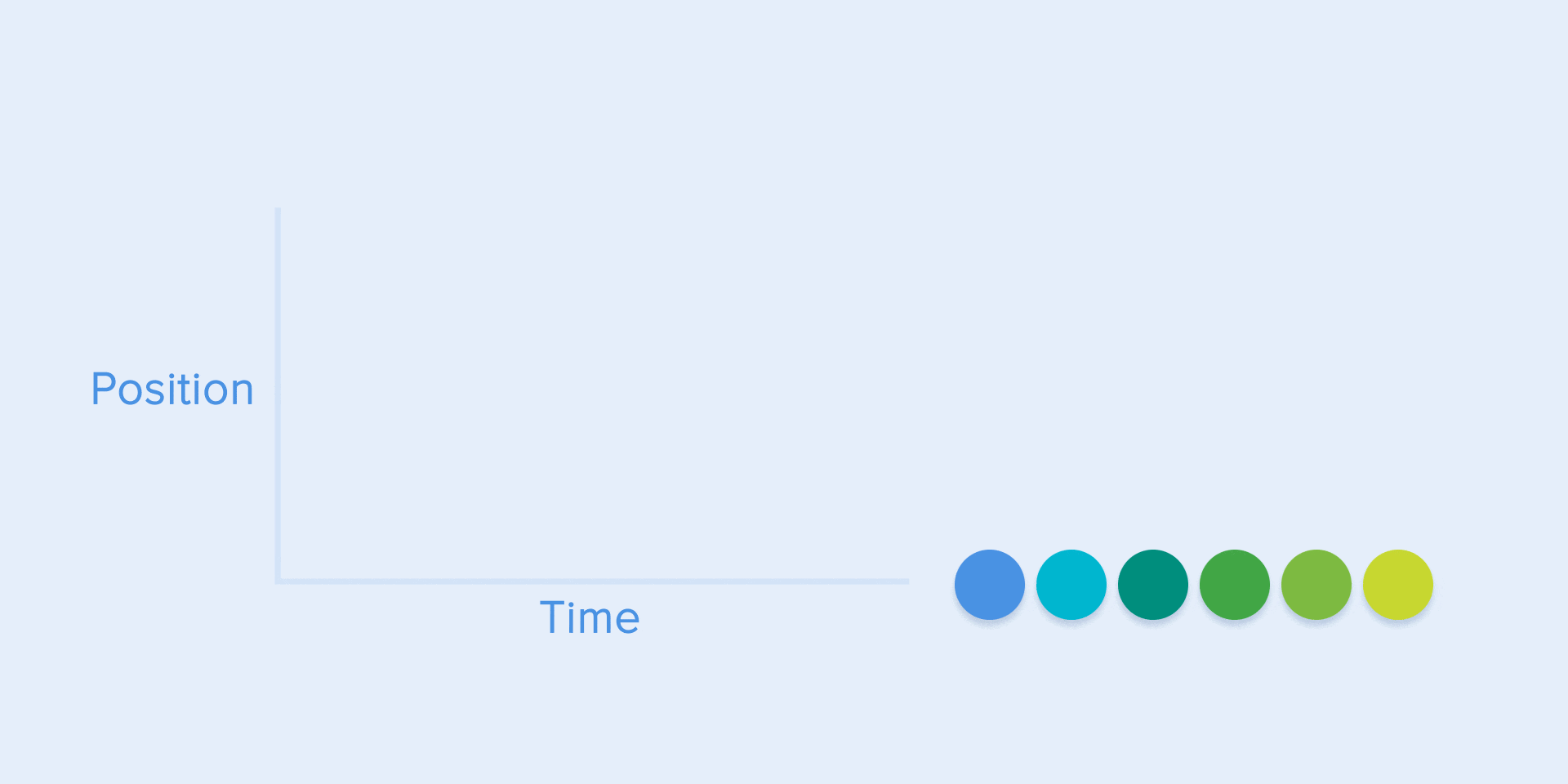
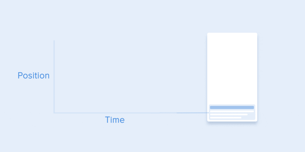
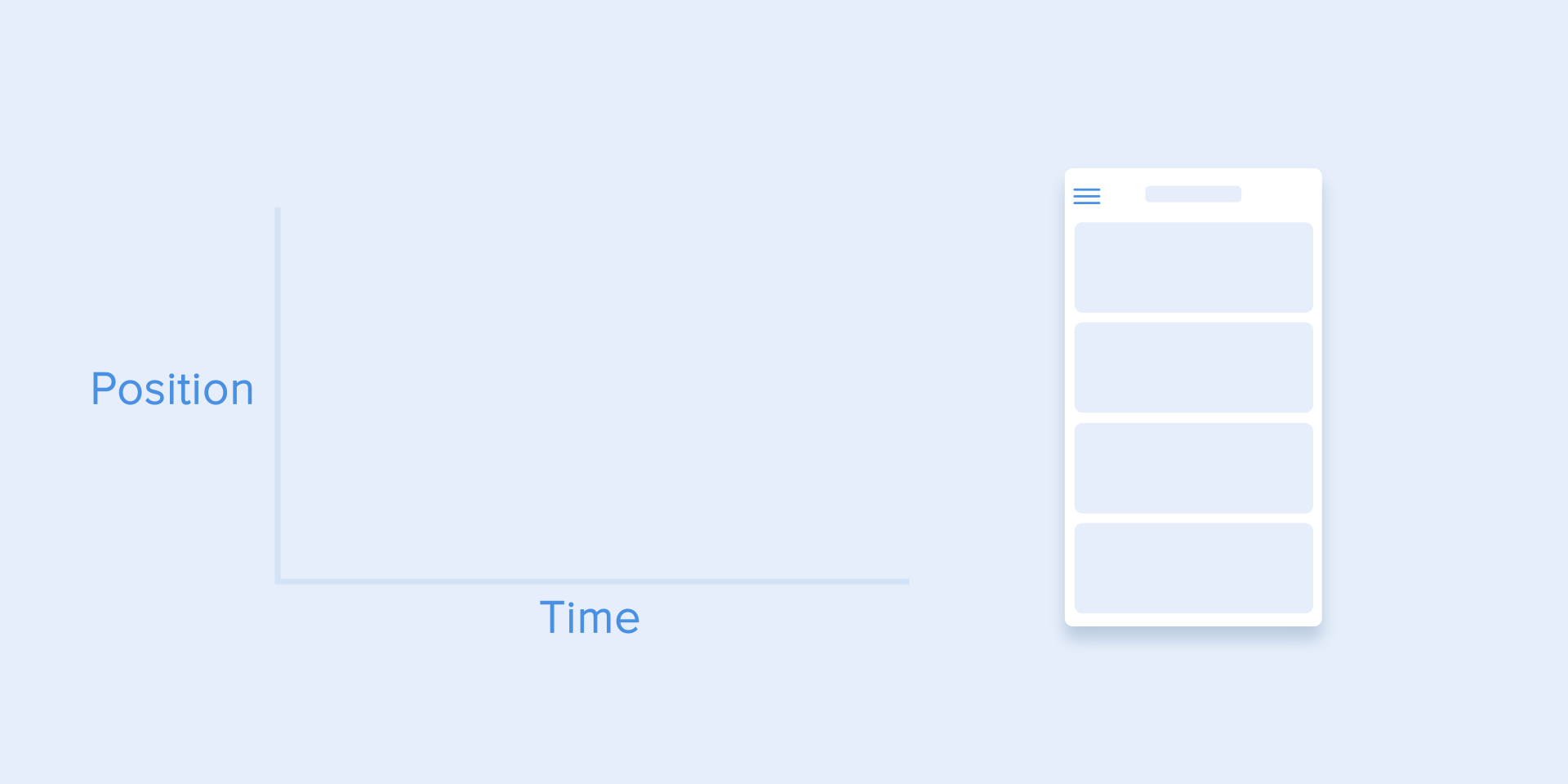
All apps with animations use motion curves. I will try to explain how to read them and what they mean. The curve shows how the position of the object (y-axis) changes over the same period (x-axis). In the present case, the motion is linear, so the object moves the same distance at the same time.
For example, linear motion can be used only when the object changes its color or transparency. In general, we can use it for states when an object does not change its position.
2.3. Ease-in hoặc đường cong tăng tốc (Ease-in or acceleration curve)
We can see on the curve at the top the position of the object changes slowly and the speed increases. That means the object is moving with a certain acceleration.
This curve should be used when objects are flying out of the screen at full speed. It could be a system message. But keep in mind that such kind of curve should be used only when the objects leave the screen forever and we cannot be called back or back.
The animation curve helps to express the right mood. In the example below we can see that the travel times and distances are the same for all objects, but even small changes in the curve give you the ability to affect the state of the object. animation.
And of course, by changing the curves, you can move the object just like it would in the real world.
2.4. Ease-out hoặc đường cong giảm tốc (Ease-out or deceleration curve)
This type of curve should be used when objects appear on the screen – it moves up the screen at full speed, gradually slowing down until it comes to a complete stop. This can also be applied to other cards or objects that appear from outside the screen.
2.5. Ease-in-out or standard curve
This curve causes objects to gain speed at the beginning and then slowly drop it to zero. That type of movement is most often used in interface animations. Whenever you question what kind of motion to use for your animation, use a standard curve.
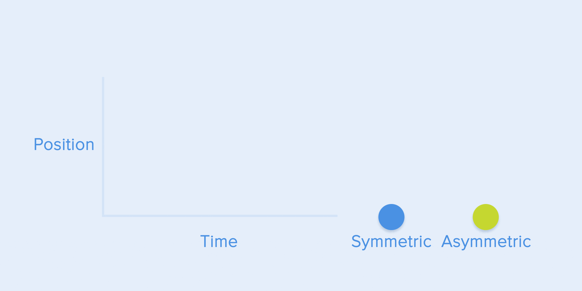
According to Material Design Guidelines, it is better to use asymmetrical curves to make the movement look more natural and realistic. The end of the curve must be emphasized more than its beginning, so the acceleration time is shorter than the slow down. In this case, the user will pay more attention to the final motion of the object and to its new state.
Ease of use when objects move from one part of the screen to another. In this case, the animation avoids eye tracking and is impressive.
The same type of motion should be used when the object disappears from the screen, but the user can return it to its previous position at any time. Like the example below about the left menu.
From these examples follows a basic rule that many beginners forget – the starting animation is not equal to the ending animation. As in the case with the left menu – it appears with the deceleration curve and disappears with the standard curve. Besides, according to Google’s Material Design, the time to appear the object should be longer to attract more attention.
Conclude:
And that’s the end of the article, thank you for patiently following here, I hope that some of the best tutorials on animation in UX I listed above can help you in the process. work. I just mentioned some of the commonly used animations