Contents
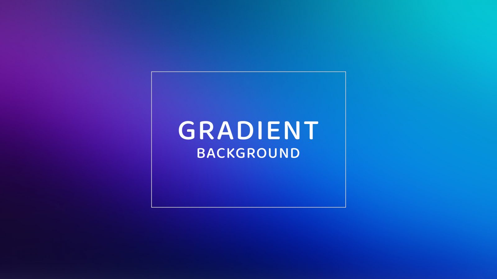
Nowadays, color is an integral part of a website. In choosing colors for a website, many times we want to choose a color range that transitions smoothly between 2 or more colors. Today I will show you how to add gradient colors using CSS.
Today I will show you how to get gradient background to use for your website, banner, or any other design
In CSS there are 3 different types of gradients:
- Linear Gradients (goes down/up/left/right/diagonally).
- Radial Gradients (defined by their center).
Here we will go into understanding each type of gradient.
1. CSS Linear Gradients
Linear Gradients are created by at least 2 specified color points
Syntax:
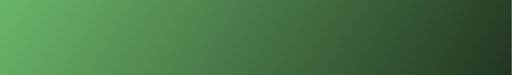
background-image: linear-gradient(direction, color-stop1, color-stop2, ...);Example:
background: linear-gradient(121deg, rgba(93,182,103,0.9948354341736695) 0%, rgba(32,54,34,1) 100%);
a. Direction – Top to Bottom
This is the default value of this gradient type
Syntax:
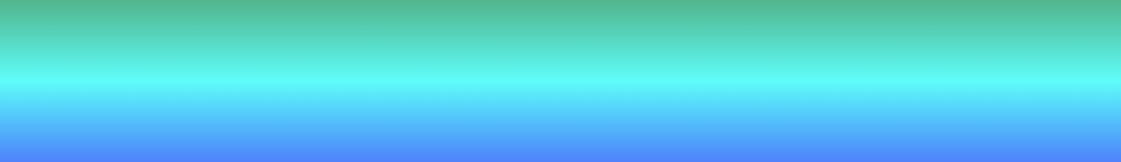
background-image: linear-gradient(to bottom, color-stop1, color-stop2, ...);Example:
background-image: linear-gradient(to bottom, rgb(58, 180, 137) 0%, rgb(29, 253, 249) 50%, rgb(69, 126, 252) 100%);
b. Direction – Left to Right
Syntax:
background-image: linear-gradient(left to right, color-stop1, color-stop2, ...);
Example:
background-image: linear-gradient(to right, rgb(114, 58, 180) 0%, rgb(253, 29, 193) 50%, rgb(252, 69, 89) 100%);

c. Direction – Diagonal
We can also create a diagonal gradient by selecting colors horizontally and vertically.
Syntax:
background-image: linear-gradient(to bottom right, color-stop1, color-stop2, ...);Example:
background-image: linear-gradient(to bottom right, rgb(180, 65, 58) 0%, rgb(253, 121, 29) 50%, rgb(252, 221, 69) 100%);

d. Direction – Angle
Syntax:
background-image: linear-gradient(angle, color-stop1, color-stop2);Example:
background: linear-gradient(90deg, rgba(238,174,202,1) 0%, rgba(148,187,233,1) 100%);

2. Radial Gradients
Syntax:
background-image: linear-gradient(angle, color-stop1, color-stop2);Example:
background: radial-gradient(circle, rgba(63,94,251,1) 0%, rgba(252,70,107,1) 100%);
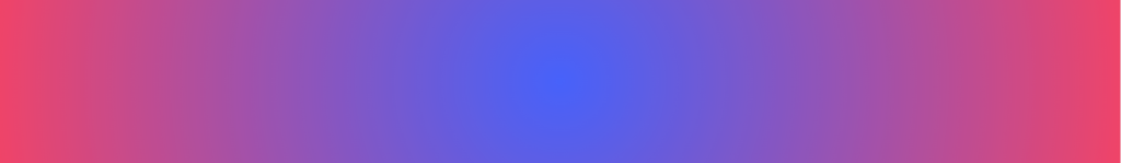
background: radial-gradient(circle, rgba(63,94,251,1) 0%, rgba(252,70,107,1) 100%);